Veuve Clicquot
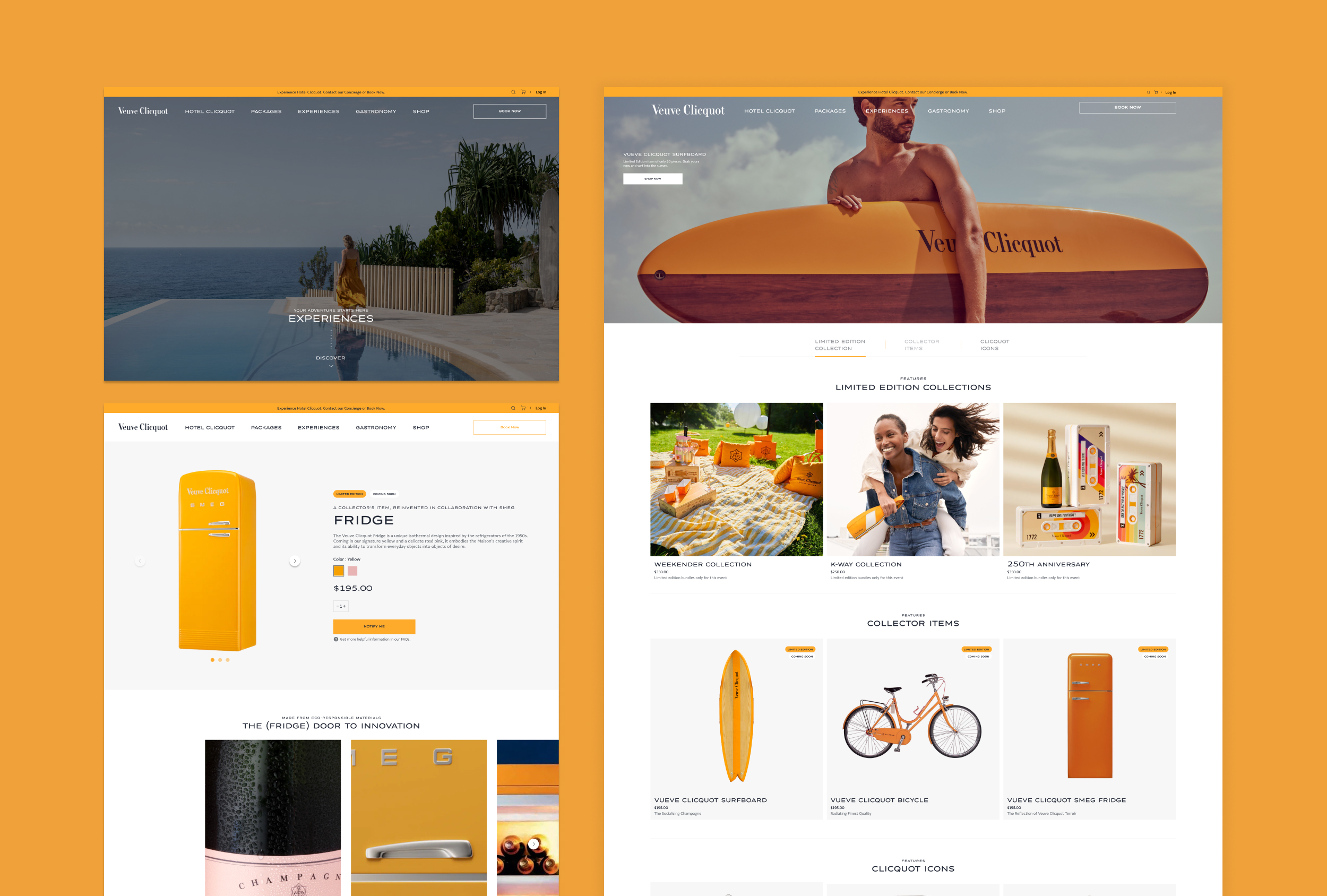
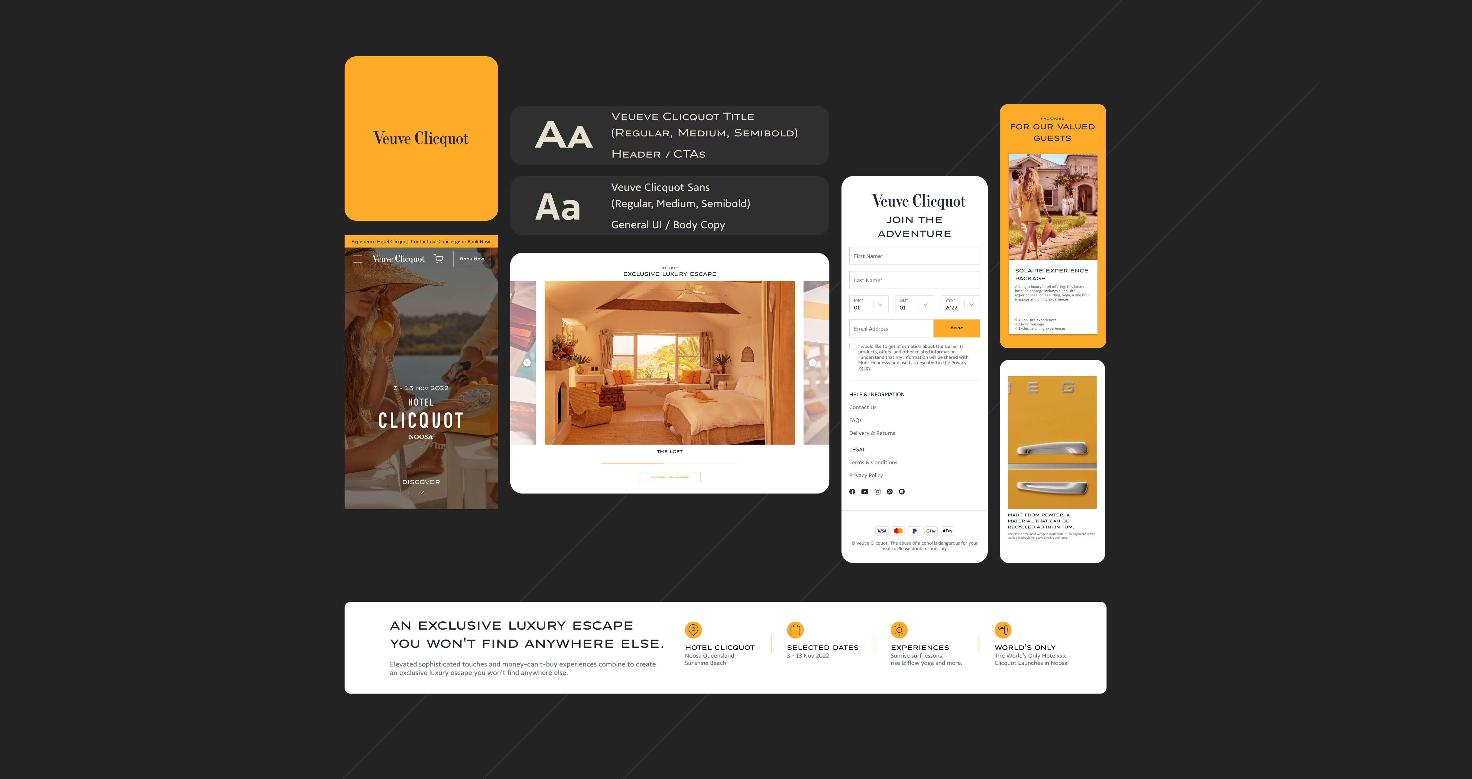
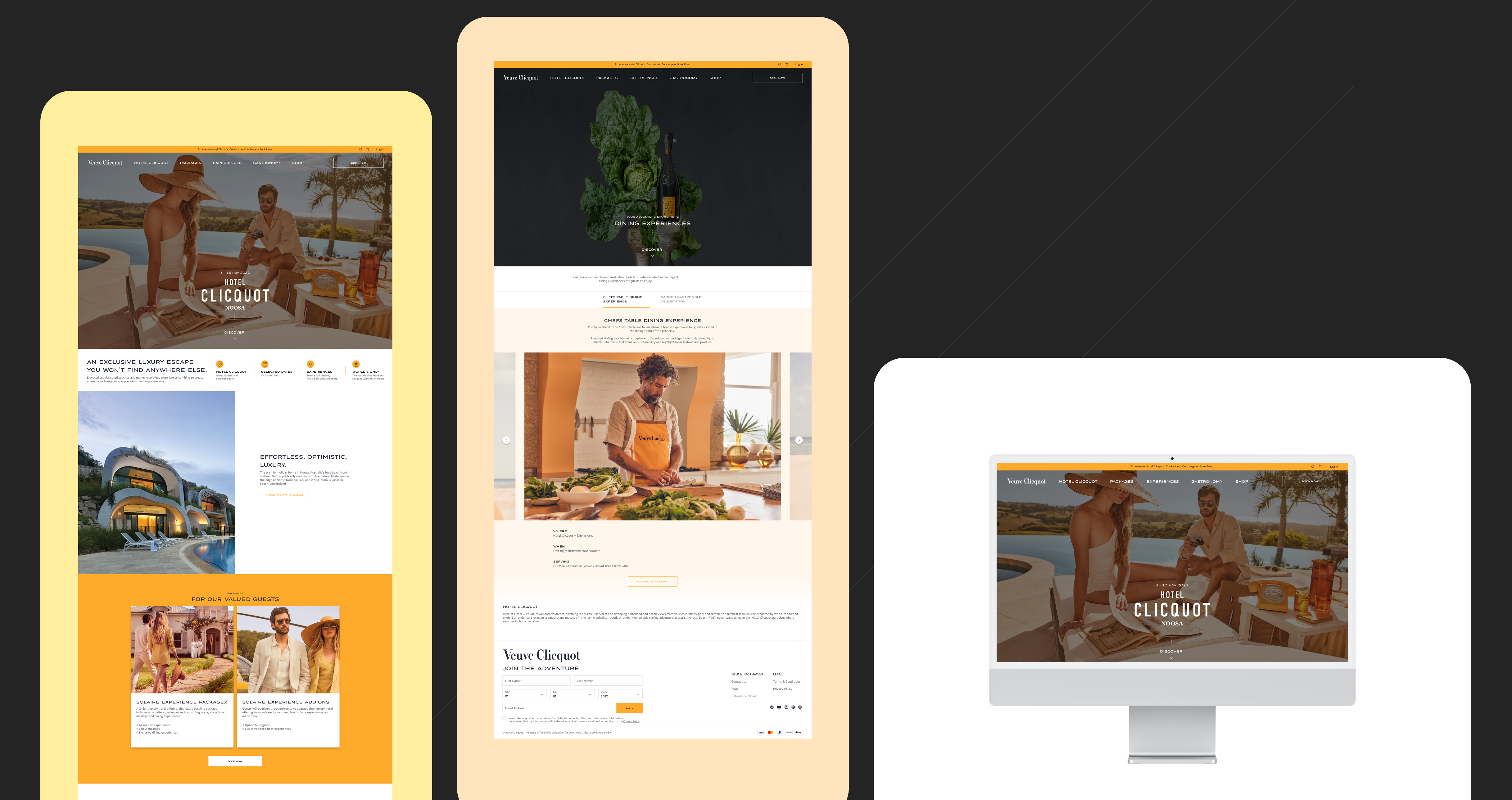
The project was unique as it involved a heavy emphasis on experience and eCommerce, rather than being a stand-alone eCommerce site. This required us to split the project, dedicating enough pages to showcase the different experiences available, while still incorporating eCommerce functionality seamlessly.

It sat at the intersection of brand experience and commerce. Rather than focusing purely on transactions, the platform needed to capture the essence of the Veuve Clicquot lifestyle and translate that into a digital experience.
Typography is handled with clarity and confidence, creating a strong hierarchy that guides users from collection browsing down to product selection without friction. The grid system is structured and predictable, which supports quick scanning while still feeling editorial rather than purely transactional.
From a UX perspective, the flow is intentionally low-friction—users can move seamlessly from discovery to purchase, with minimal cognitive load. Navigation is straightforward, filters are unobtrusive, and the product cards prioritise clarity over feature overload. This ensures that usability is not compromised by the brand’s premium positioning.
More projects.


Let’s talk
I’d love to hear from you — whether you have a project in mind, or just want to say hi.
Thank you! Your submission has been received!
Oops! Something went wrong while submitting the form.